
How to zzz
Brief:
For this brief my group and I aimed to create a 45 - 90 second educational animation for University students. Explaining the importance of sleep and how to sleep better.
Research :
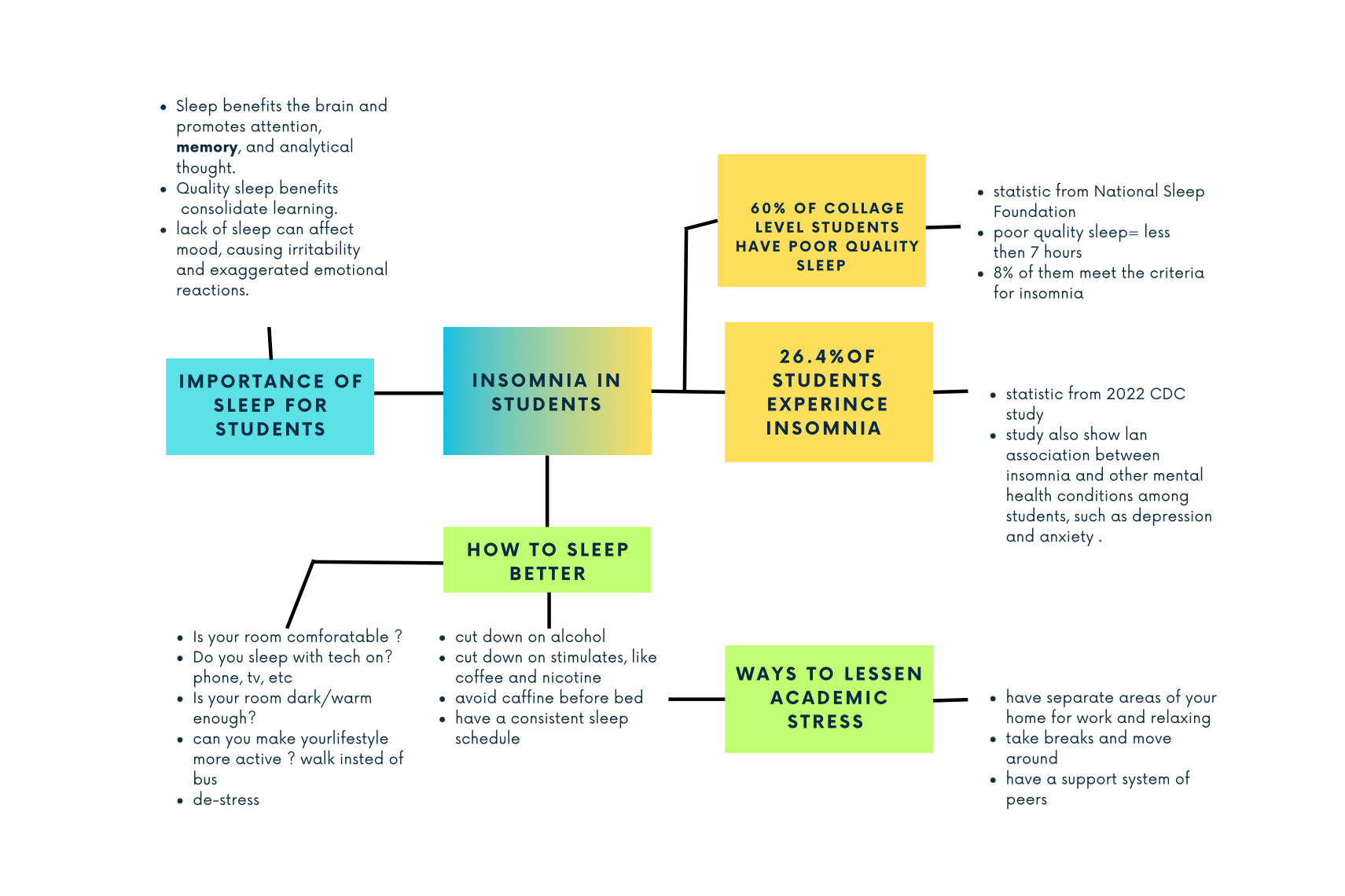
I researched student sleep statistics and the importance of sleep specifically for university students. Most of my research centered around how to sleep better, as this is the information we would include in our video.
After watching this video we want the viewer to feel motivated to improve their sleep. We decided to include 3 main strategies to sleep better in our video, change your environment, avoid distractions, and stick to a regular sleep schedule.
Animation testing
Before we started making our animation I decided to do some test animations. Even though the specific effects seen in my tests were not used in our final animation, this process was still helpful. It helped me get re-acquainted with Adobe After Effects, I also learned new effect techniques.
Workshops:
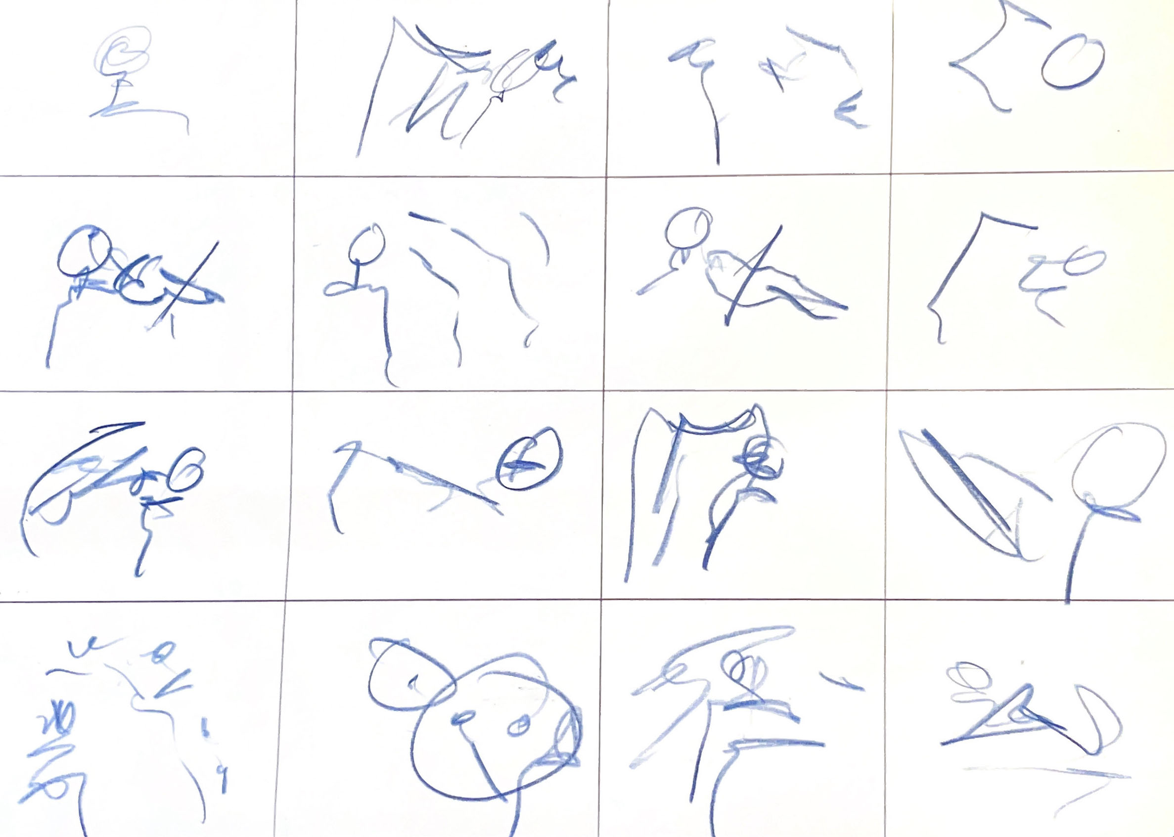
The workshops for this project were incredibly enjoyable and useful. The storyboard workshop showed us that you can communicate a clear story without super-polished visuals. I also really enjoyed the film workshop, scratching patterns into the film. My group and I liked the texture this achieved and decided we wanted to incorporate some type of texture into our animation.
My initial storyboarding:
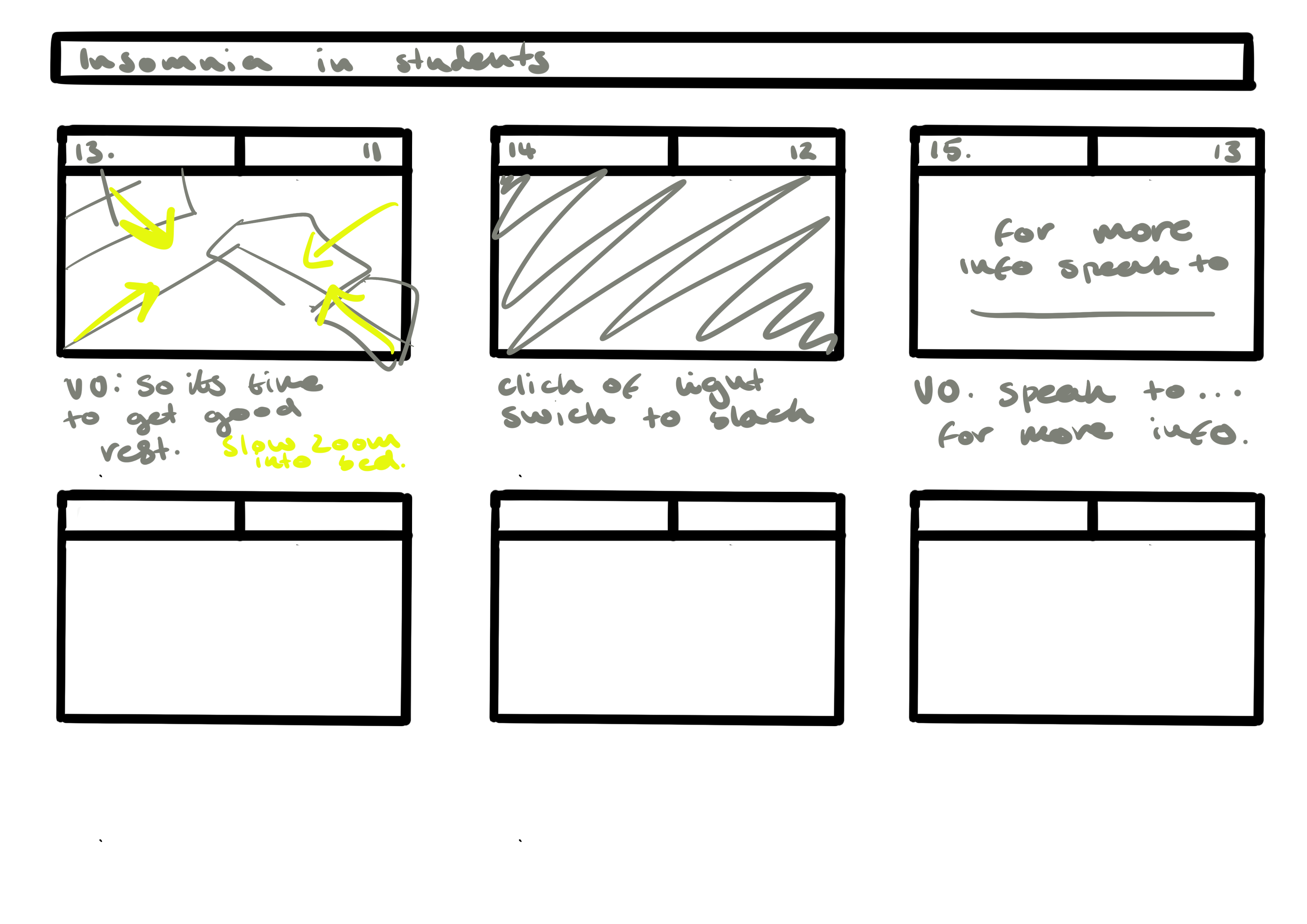
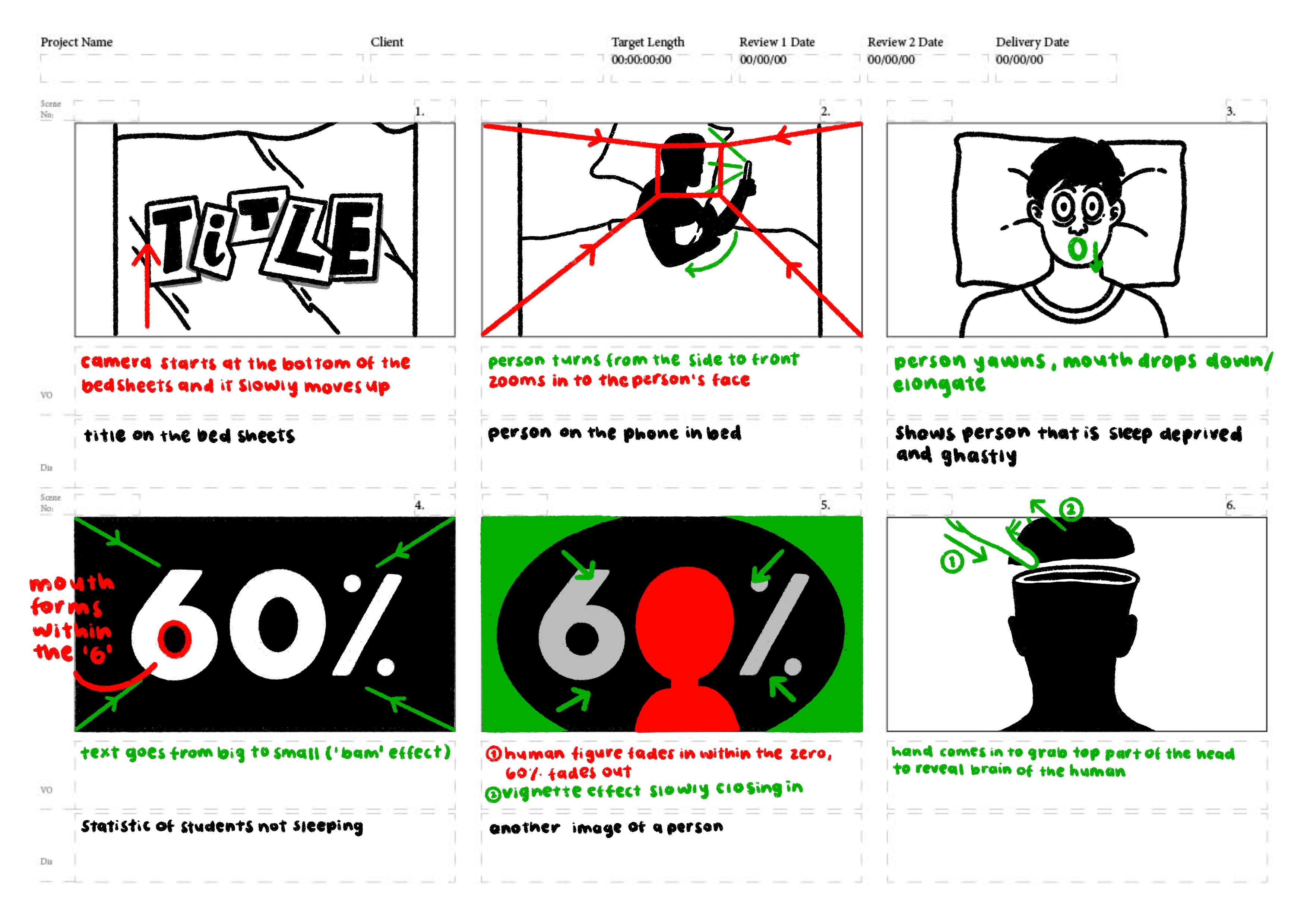
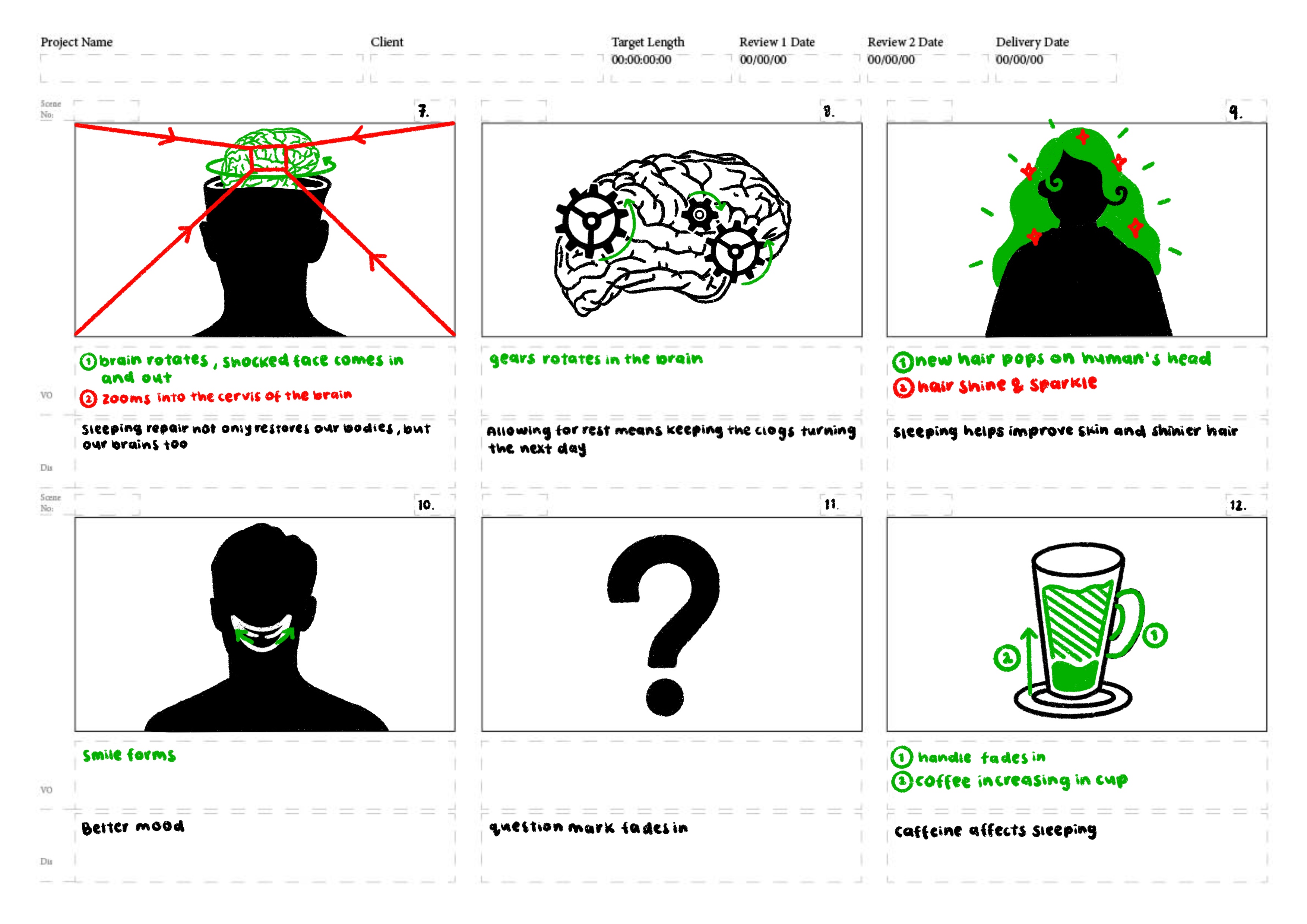
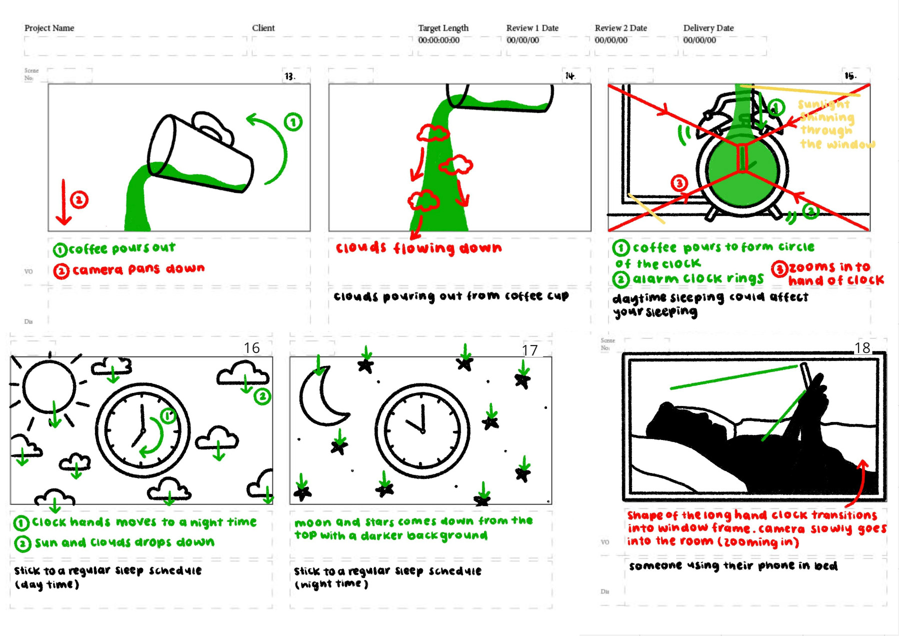
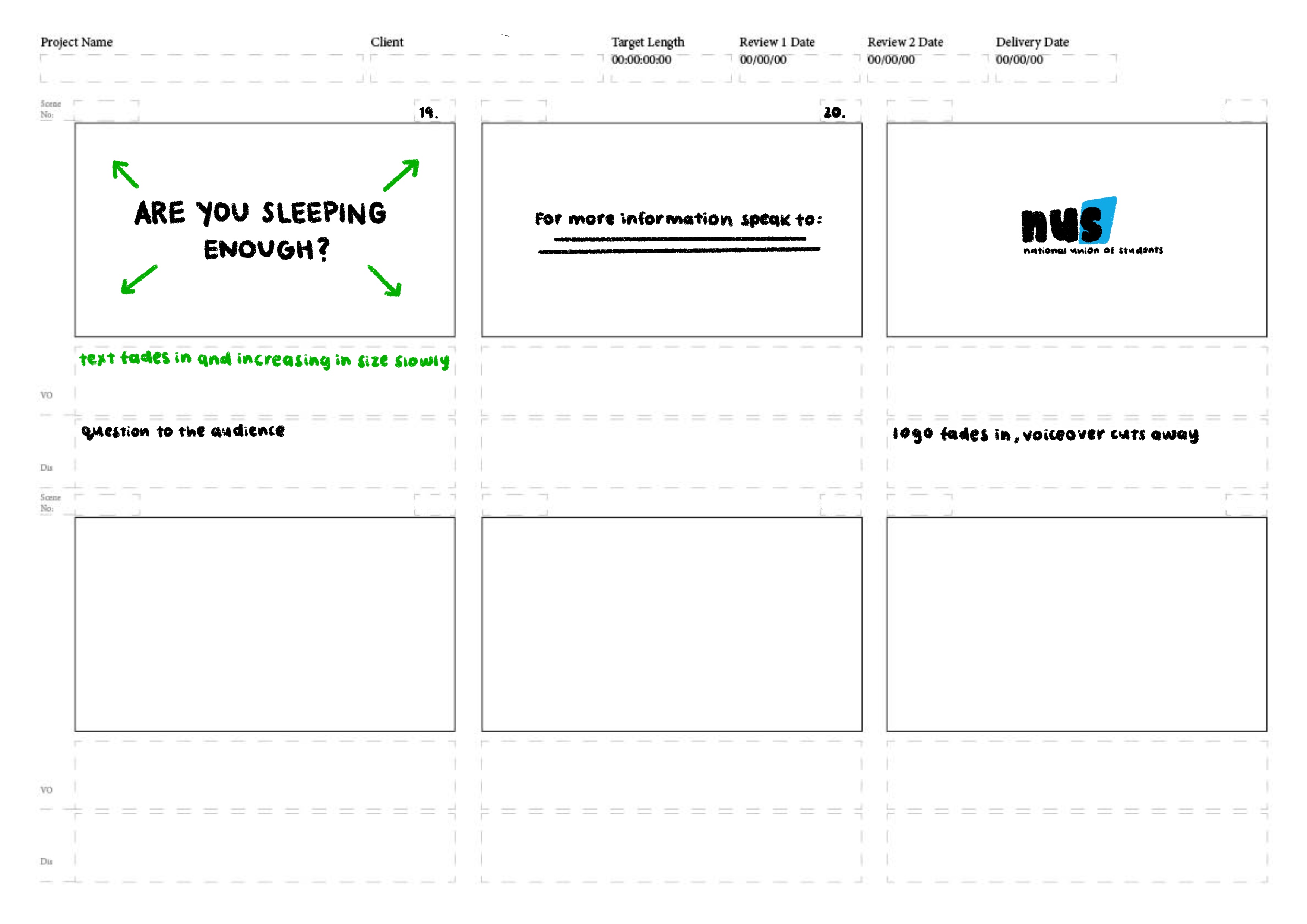
Once my team and I had a basic script that explained the 3 main strategies, we divided up the lines and started generating quick initial storyboards. After combining and re-working sections from each of our individual storyboards my team and I came up with our final storyboard.
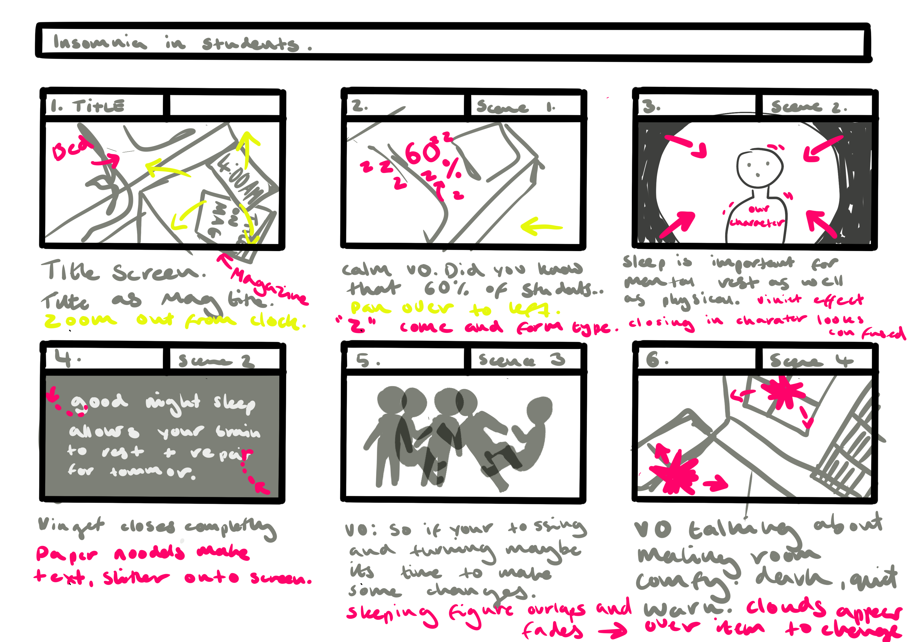
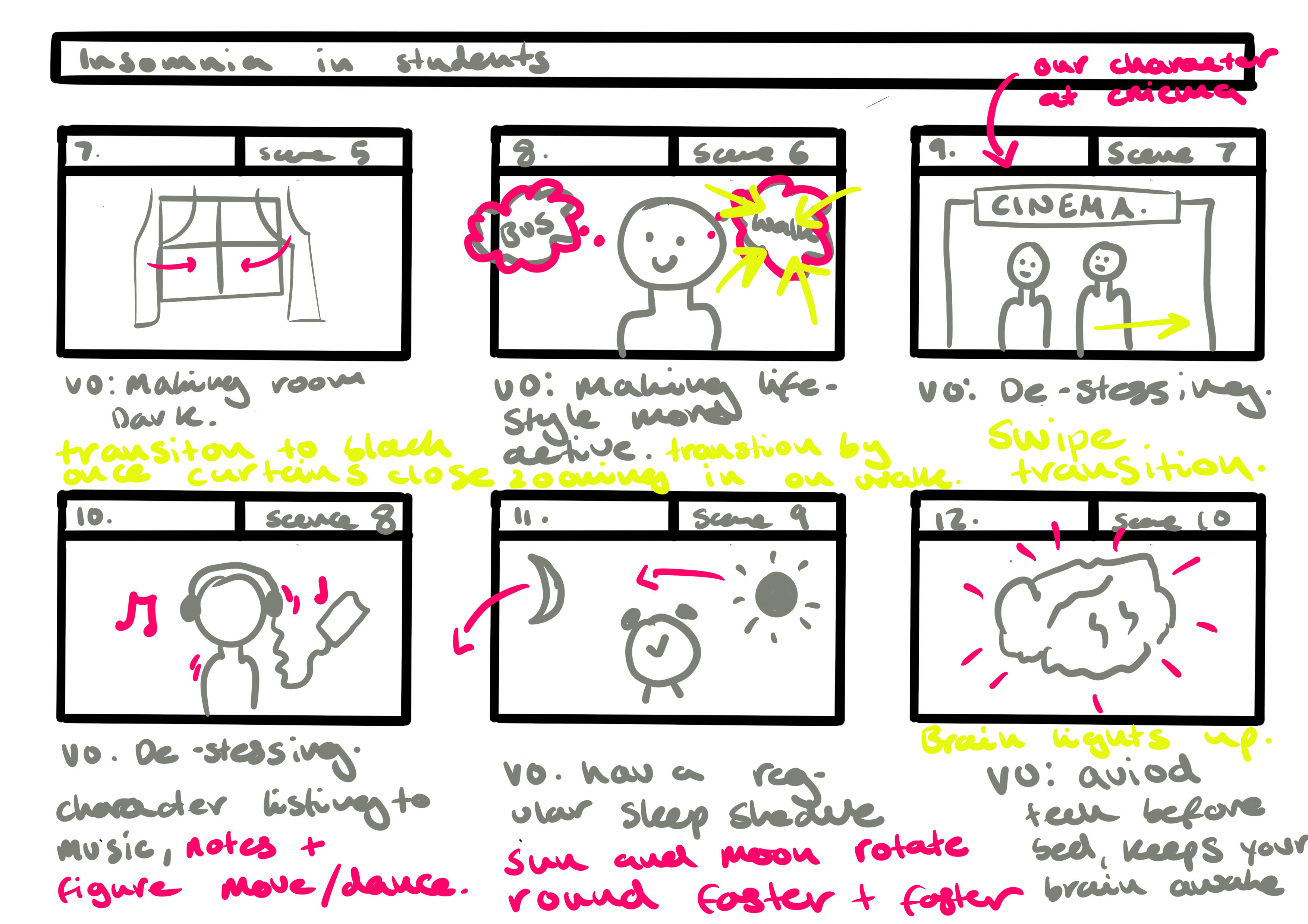
Final storyboard:
Animatic:
Constructing an animatic helped us better visualize the end product. It also helped highlight areas of the animation that needed more work to translate from page to motion. My team and I also decided to include more sound effects such as the coffee pouring and paper scrunching.
Animation style:
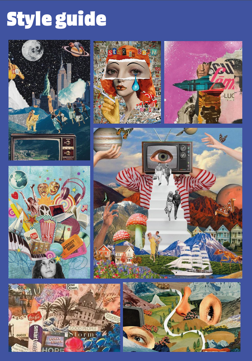
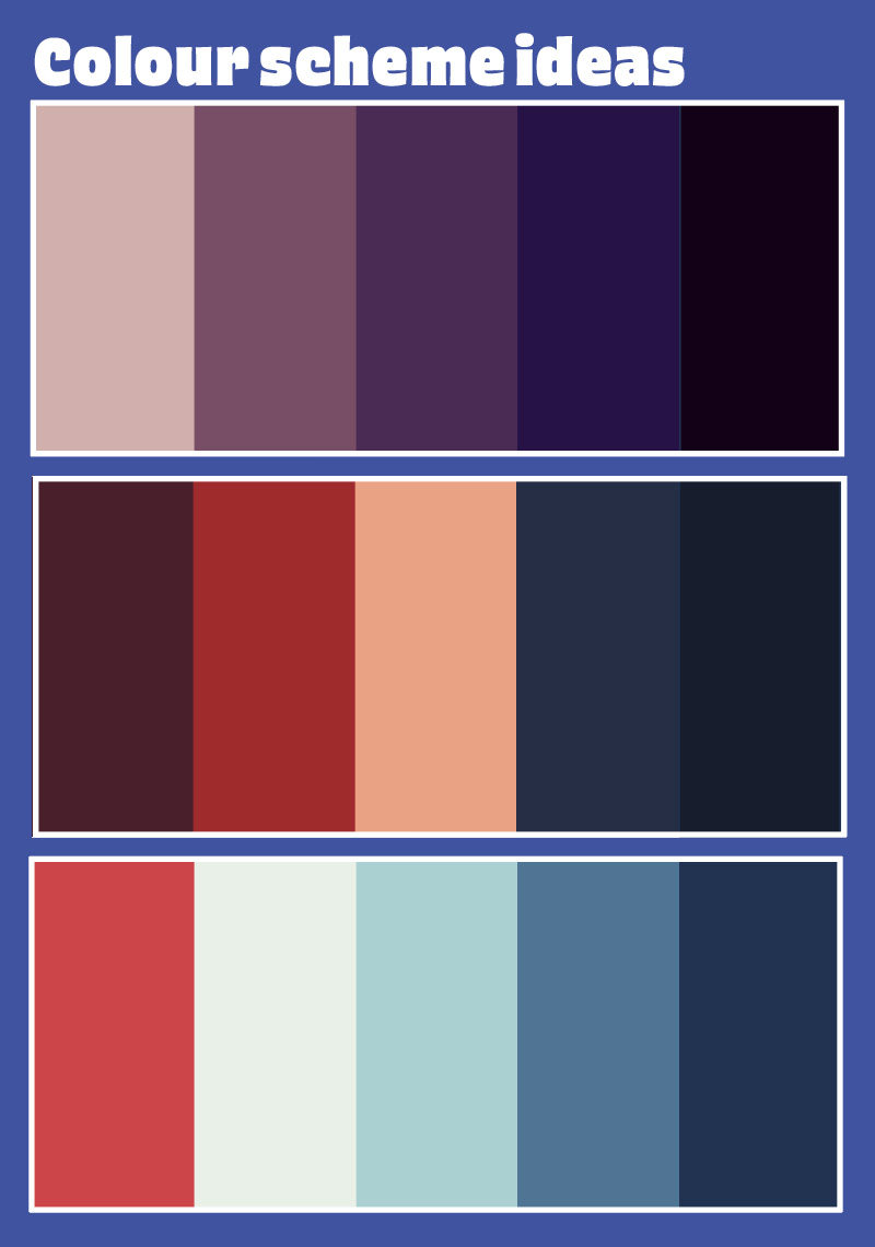
Before animating we made several style references. We chose a collage style of animation because it offers a unique and visually engaging approach to storytelling. We kept in mind our target audience of university students, our aim is for the animation to resonate as helpful and friendly not condescending. We also liked that the handcrafted feel of collage animation helped communicate authenticity. Additionally choosing a collage style allowed us to play with textures and more abstract transitions. We chose to use mostly muted colors and blue tones to communicate a sense of tranquility.
Overall I think this project was successful. My team and I created an informative animation with a fun engaging style. It was appropriate for our target audience as it is being used by AUB's student services. My after-effects skills improved significantly through this project along with my teamwork skills. With each of us animating a different section it was crucial that we communicated and shared files.
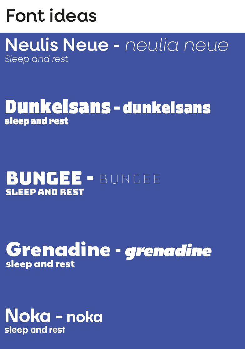
Initially, we planned to create a character to talk the viewers through how to sleep better. As we developed our visual style we decided not to do this as we felt having a character could be too childish for our demographic. We decided to include several student representations in the collage instead. By featuring real students in the animation, we created a connection with our audience. I think our choice of font and color matched the subject matter. The use of blues and muted colors created a sense of calm. The dream background music and calm voice-over also add to this. If I could do something different with this project I would have done the animation tests after we created our storyboard. Doing it in this order would allow me to practice more relevant effects. Additionally, I would have left more time to complete the animation because there are a few motion sections that could be smoother. British Heart Foundation (2018). Sleeping tips. [online] Bhf.org.uk. Available at: https://www.bhf.org.uk/informationsupport/heart-matters-magazine/wellbeing/sleeping-tips. Mbous, Y.P.V., Nili, M., Mohamed, R. and Dwibedi, N. (2022). Psychosocial Correlates of Insomnia Among College Students. Preventing Chronic Disease, [online] 19(19). doi:https://doi.org/10.5888/pcd19.220060. Suni, E. and Singh, A. (2020). How to sleep better. [online] Sleep Foundation. Available at: https://www.sleepfoundation.org/sleep-hygiene/healthy-sleep-tips. Wein, H. (2021). Good Sleep for Good Health. [online] NIH News in Health. Available at: https://newsinhealth.nih.gov/2021/04/good-sleep-good-health#:~:text=Good%20sleep%20improves%20your%20brain. www.mentalhealth.org.uk. (n.d.). Sleep Matters: The Impact Of Sleep On Health And Wellbeing. [online] Available at: https://www.mentalhealth.org.uk/explore-mental-health/publications/sleep-matters-impact-sleep-health-and-wellbeing#:~:text=Sleep%20is%20an%20essential%20and. 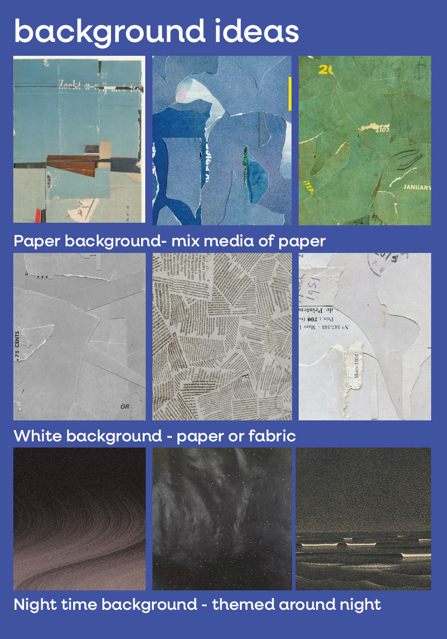
"How to zzz" animation
Bibliography